

MINI Global Brand Relaunch
MINI is one of the most recognisable car brands in the world – and one of the most difficult to evolve. The identity had built up decades of equity, but had lost the sharpness and cultural confidence that once made it iconic.
As Lead Designer at KKLD*, I was responsible for the complete relaunch of MINI's global brand identity – from the ground up. New logo, new typography, a new image language, and a design system built to scale across every market, medium and touchpoint worldwide. The redesigned flat logo set a new standard – not just for MINI, but for the automotive industry. Beyond the visual identity, the work extended into MINI's strategic repositioning as a lifestyle and culture brand: A/D/O in New York, MINI Living, MINI Fashion, and URBAN-X. The brand value increased by 18% within the first year – the highest rise of any automotive brand in the global top 100.
Client
MINI International (BMW Group)
Year
2014 - 2020
Task
With KKLD*, I have developed a completely new global corporate identity for the MINI brand.
The cult brand’s new appearance includes a new logo, new visual and design identity, new typography as well as a complete new brand strategy.
KKLD* worked closely with MINI in order to create a consistent strategic, creative and communicative rebranding which will be applied to all products and services and gradually rolled out across all channels and consumer touchpoints. I contributed form the very first moment developing the conceptual and general design directions, like logo and the all over look and feel.
(As senior designer and creative director)
Core Design Team
Franziska Schwarz, Jan-Kristof Lipp, Laura Larini, Patrizia Kommerell, Nicole Algieri, Marcella Grupp


The global redesign of MINI was strictly based on the brand strategy and positioning defined in advance. Sustainable longevity of brand recognition and universal interdisciplinary applicability of the core design elements across all touchpoints had priority here.
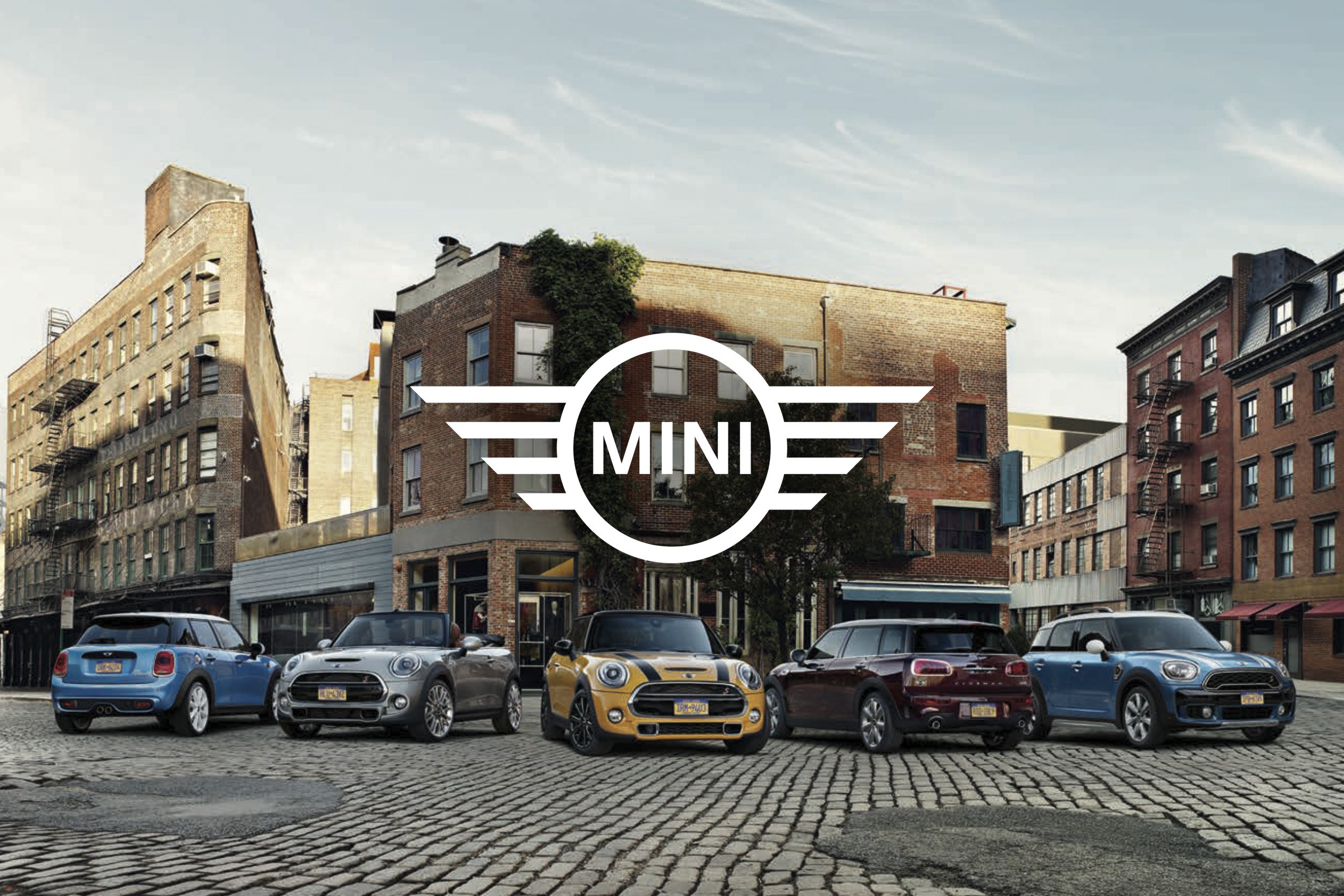
The new logo
The redesigned, reduced flat logo enabled consistent use across all required platforms and applications - and established a new logo design standard for the entire industry.


Two new fonts
Two new, specially created corporate fonts formed the conceptual link between the brand's past and heritage and the future. MINI Serif and MINI Sans Serif.


Image Tonality
MINI's iconic imagery was brought out of the night into the day and transferred, together with product models, into entire closed visual worlds. The aim was to create a well-founded, consistent, strong design basis - which survives trends and can create space for something new.


Brand Layout

MINI stands for minimalism, clarity and sustainability. The minimum footprint is anchored in the core values of brand behavior. The new resource-saving, universal design language has been implemented barrier-free through simplification.


Digital Applications


Spatial Brand Design

At the International Motor Show IAA in 2015, the MINI exhibition space developed by Meiré und Meiré was the first opportunity for the public to experience the brand’s new orientation in real space. CI elements, media and product installations were created in close consultation with KKLD*.


The Result
MINI brand value climbed by 18%, the highest increase of any automotive brand in the top 100.
(Interbrand, Best Global Brands, 2016)